Two-tone cabinets have moved from a design trend to a practical way to give a kitchen depth without a full custom stone-and-tile budget. The idea is simple: run one color on the perimeter cabinets and a second on the island, the base cabinets, or a hutch. Done well, it makes a room feel taller, warmer, or more intentional. Done carelessly, it looks like two half-finished kitchens sharing a wall. At American Built Cabinets, we build these layouts every week for clients across San Jose, San Francisco, and San Mateo, and the choices that matter most usually happen before the first door is sprayed.
Why Two-Tone Works (and When It Doesn't)
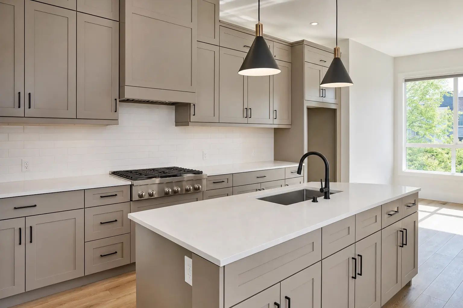
The reason two-tone reads as designed rather than accidental is contrast placement. Your eye needs a clear reason for the split. The most common and forgiving approach is a lighter perimeter with a darker or bolder island, which anchors the room and hides the scuffs that islands take from stools and foot traffic. The reverse, dark uppers over light lowers, can work in a room with tall ceilings and good natural light, but in a compact Bay Area galley kitchen it often makes the walls feel like they're closing in.
Where two-tone falls apart is when the two colors have no relationship and no dominant one. If the split is 50/50 with equal visual weight, the kitchen feels indecisive. Pick a dominant color that covers roughly 60 to 70 percent of the cabinetry, then let the second color do the accent work on the island, a bank of tall pantry units, or open-shelf uppers. That hierarchy is what separates a deliberate look from a mismatch.
Color Combinations That Hold Up Over Time
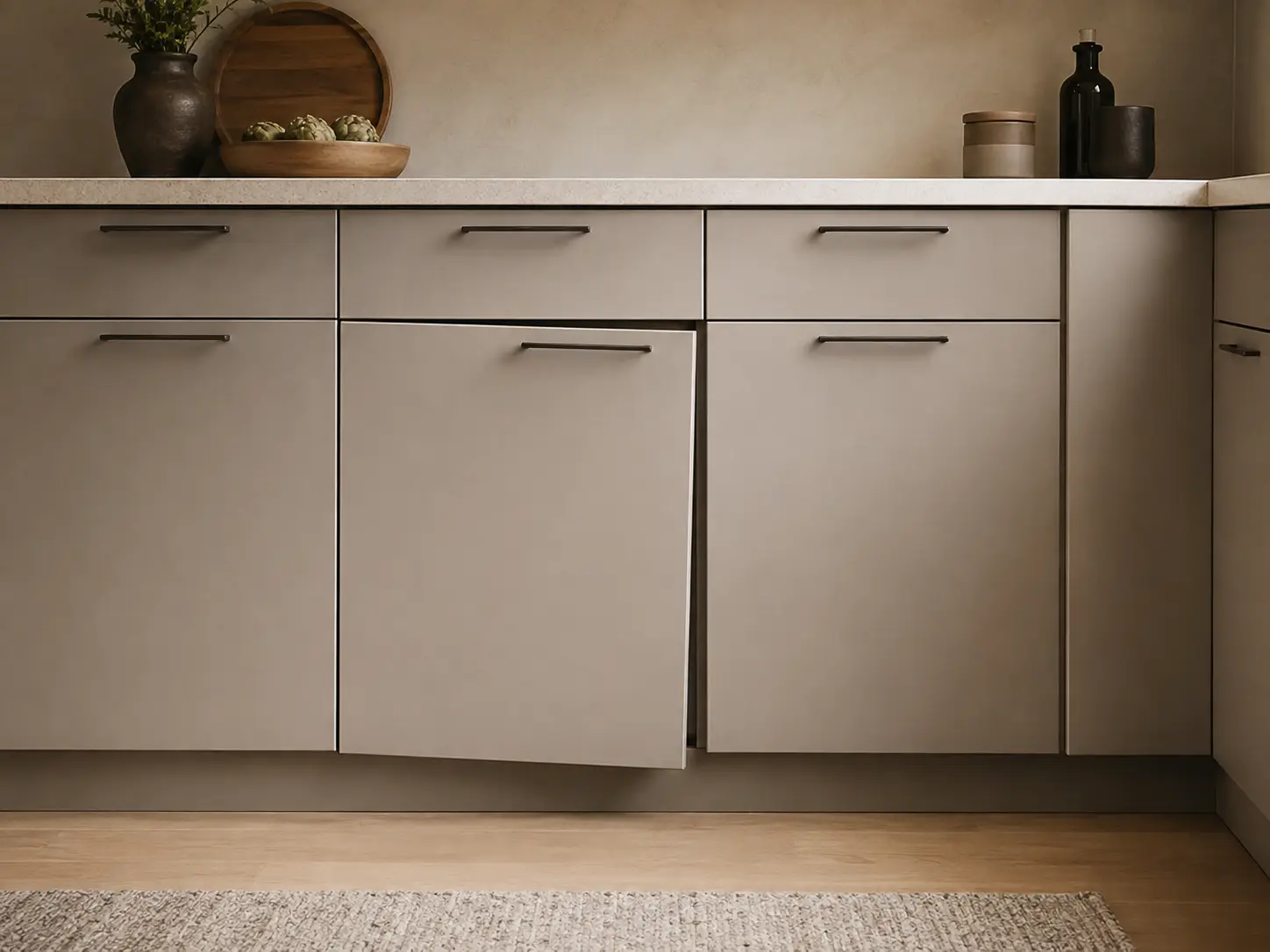
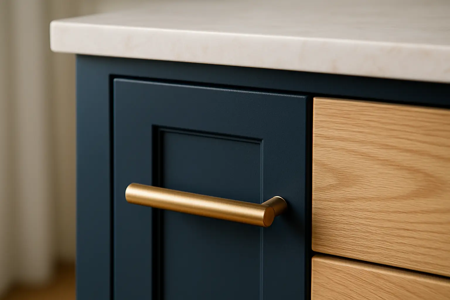
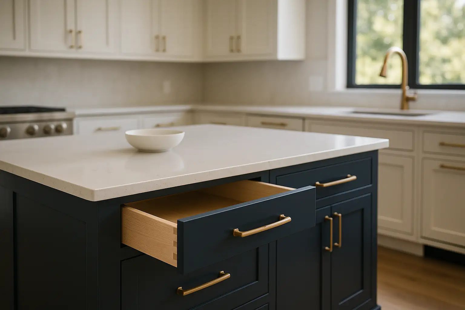
White or off-white uppers with a deep navy or forest green island is the pairing we build most, and it ages well because both colors are close to neutral in how the eye treats them. Warm white perimeter with a natural rift-cut white oak island is another favorite in Los Gatos and Palo Alto remodels, mixing a painted MDF door with a real wood veneer for texture. For a softer, more transitional look, a greige perimeter with a charcoal or muted sage lower half feels current without chasing a fad that will look dated in five years.
A note on the bold end: black lowers with white uppers is striking, but black shows dust, fingerprints, and water spots more than any other finish, so pair it with a matte conversion varnish rather than a high gloss if you want it to stay looking clean. If you're nervous about commitment, keep the perimeter subtle and put the risk on the island, which is the cheapest single element to refinish or replace later.
How Construction Choices Affect a Two-Tone Kitchen
Two-tone doesn't just double your color decisions, it can double your material decisions too. Painted doors are best built on MDF center panels because MDF won't telegraph wood grain or expand and contract at the joints, which keeps painted finishes crack-free. Stained or natural-wood elements, like that oak island, should be solid wood or high-quality veneer over plywood so the grain looks continuous and rich. It's common in our shop to spray the two colors as separate runs to avoid overspray contamination, which is one reason we build the whole kitchen in-house rather than outsourcing.
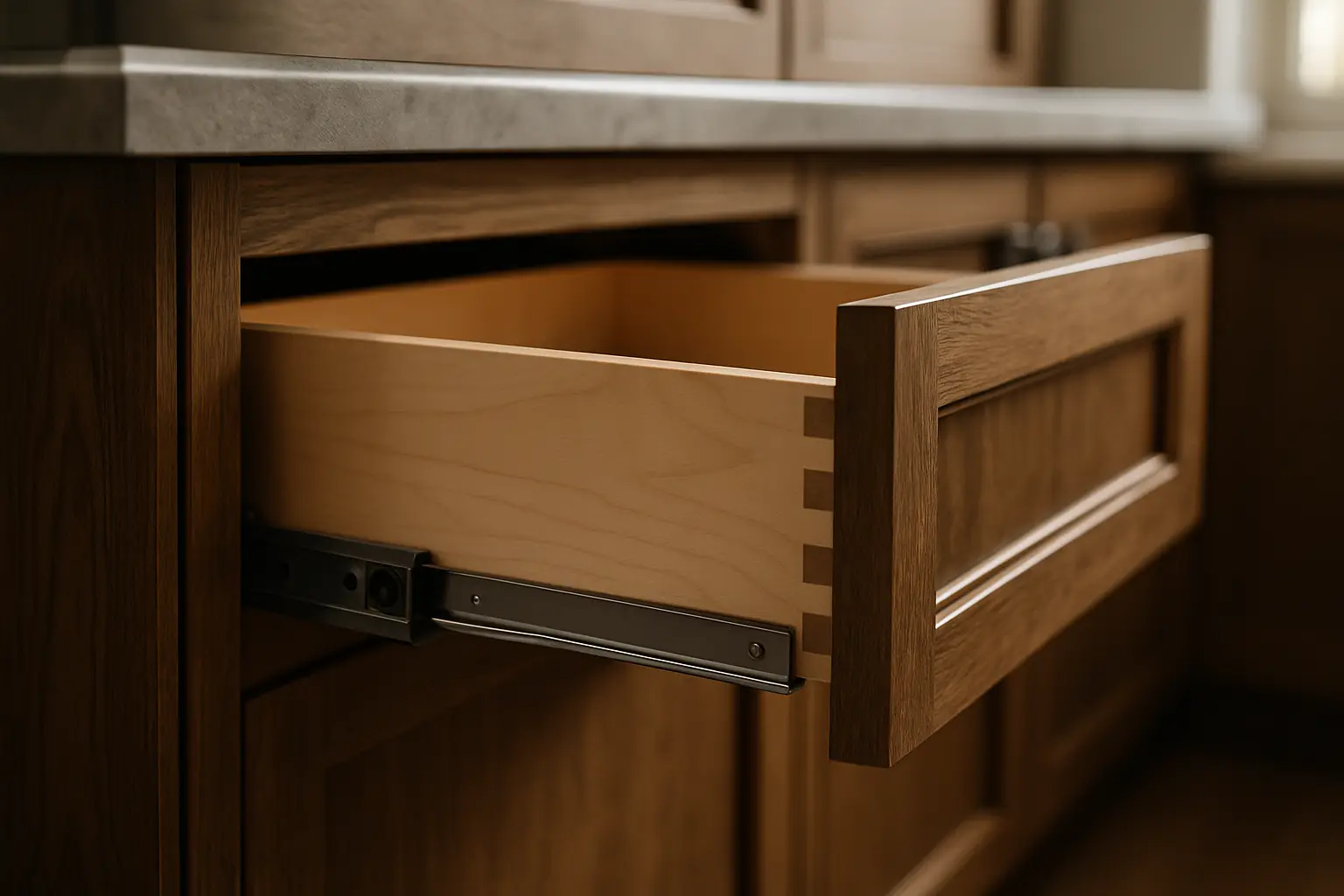
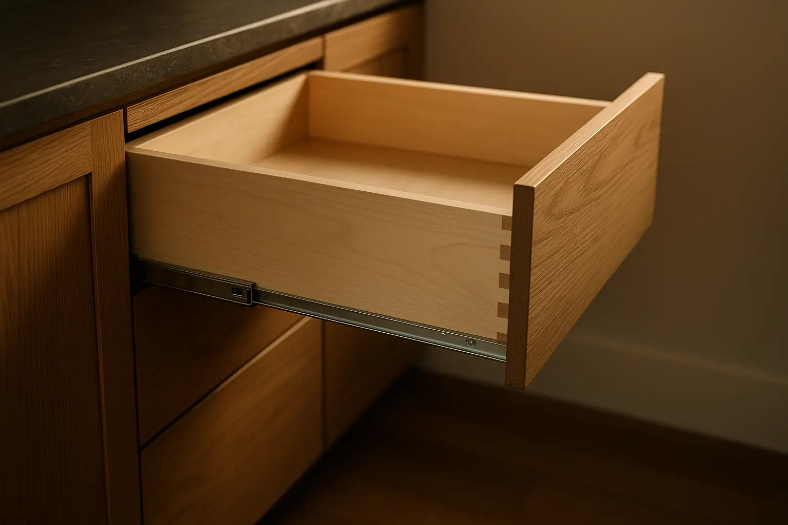
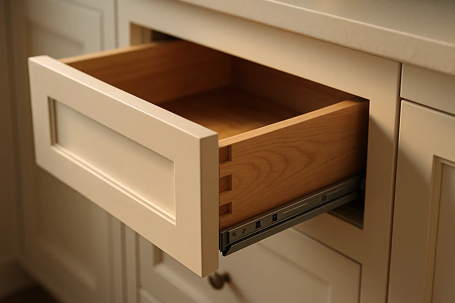
The hardware and box construction should stay consistent across both tones even if the color changes. That means 3/4-inch plywood boxes, dovetailed drawer boxes, full-extension soft-close slides, and concealed soft-close hinges throughout, so the darker island opens and closes exactly like the lighter perimeter. Mixing a semi-custom perimeter with a custom island is doable, but the reveals, door styles, and drawer depths need to match or the difference will read as a defect instead of a design choice.
Tying the Two Tones Together
The elements that keep a two-tone kitchen from feeling split are the pieces that touch both zones: countertops, hardware, and flooring. Using one countertop material across the perimeter and island creates a visual bridge, though many homeowners choose a contrasting slab on the island to reinforce the accent. If you do that, pull a vein color from the perimeter counter into the island, so the two surfaces still speak to each other.
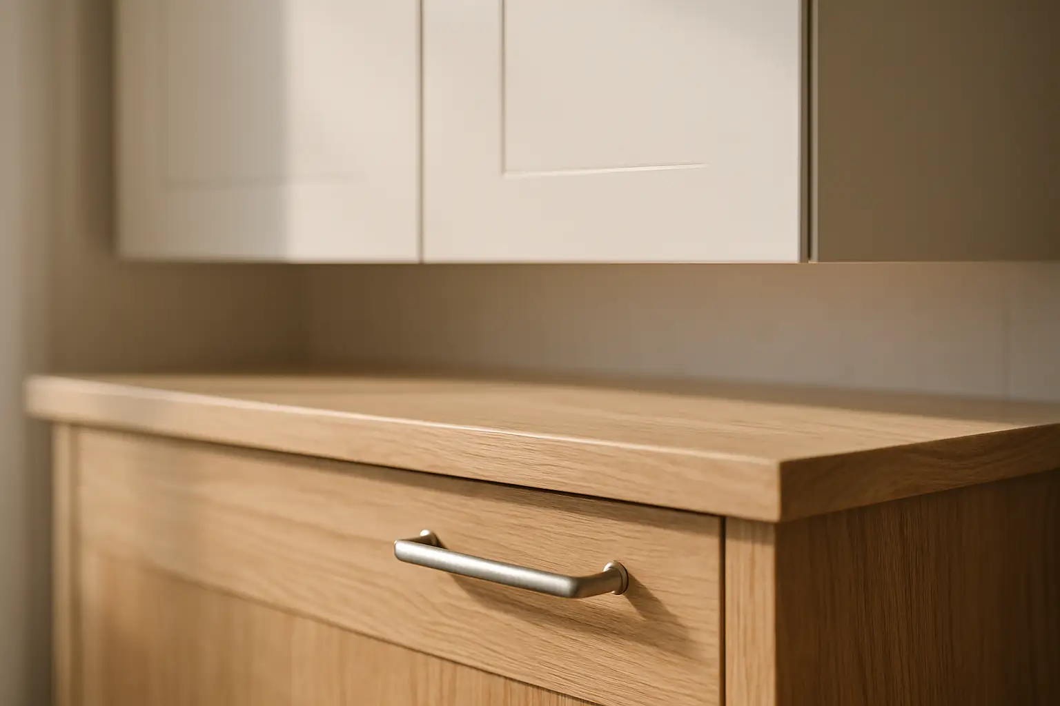
Hardware is the quiet unifier. Running the same pulls and knobs in one finish, brushed brass, matte black, or brushed nickel, across both colors stitches the room together even when the cabinet colors are very different. The other trick is repeating each color somewhere unexpected: a range hood in the island color, or a window seat in the perimeter color, so neither tone feels stranded in one corner of the kitchen.
FAQ
Q1: Does a two-tone kitchen cost more than a single-color kitchen?
A1: Yes, but the delta is small and predictable. The added cost is almost entirely finishing labor, which rises roughly 10 to 15 percent because we spray the two colors as separate runs to avoid overspray. If your second tone is a different material, say a wood-veneer island against painted MDF perimeter, budget another $400 to $800 for the veneer and matching stain on a typical Bay Area kitchen. Box construction, drawer boxes, and hardware stay identical, so the base cabinet cost does not change.
Q2: Which color should go on the island versus the perimeter?
A2: Put the bolder or darker color on the island in most cases, and keep the perimeter lighter so the wall cabinets don't feel heavy overhead. The island reads as an accent, which is exactly where you want the visual weight in a two-tone layout. Aim for the dominant perimeter color to cover about 60 to 70 percent of the cabinetry so the split looks deliberate.
Q3: Will two-tone cabinets look dated in a few years?
A3: Neutral-based pairings age best. White or greige with navy, forest green, or natural oak stays timeless because those colors read close to neutral. Trend-driven combinations like high-gloss primary colors date faster. If you want insurance, keep the perimeter subtle and reserve any bold choice for the island, which is the least expensive single element to refinish or replace later.
Q4: Can I mix painted and stained wood in the same kitchen?
A4: Yes, and it's one of the most popular two-tone looks. The key is matching construction: paint goes on MDF panels to stay crack-free, while stained sections use solid wood or wood-veneer plywood for continuous grain. As long as the door style, reveals, and hardware match, the mix looks intentional rather than mismatched.
Q5: How long does a custom two-tone kitchen take to build?
A5: Our standard lead time is about three weeks from approved drawings, and a two-tone kitchen fits inside that same window. The extra day of scheduling for separate spray runs is absorbed into our normal finishing calendar because we manufacture locally in San Jose and control the whole process in-house. You won't see the multi-month waits associated with imported cabinets.
Q6: What countertop works best with two-tone cabinets?
A6: A single countertop material across both zones is the safest way to unify the look. If you want a contrasting island slab, choose one that shares a vein or undertone with the perimeter counter so the surfaces relate. Quartz and natural stone both work; the color relationship matters more than the material.