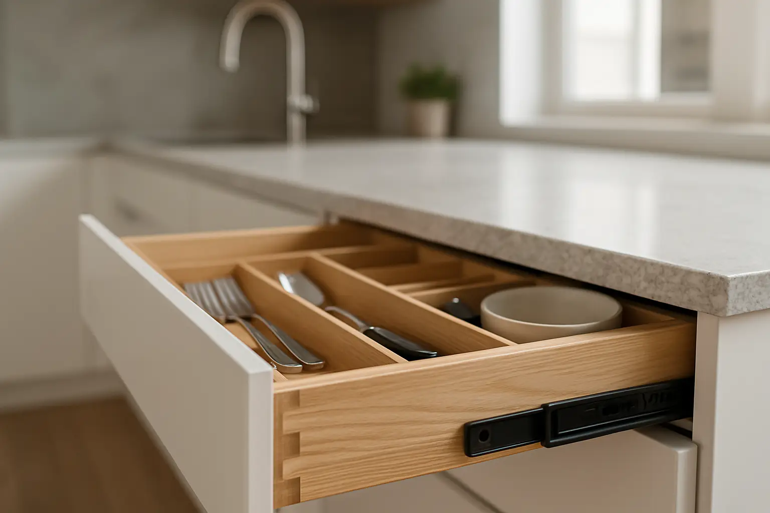
Blue has quietly become one of the most requested cabinet colors in Bay Area kitchens, showing up on islands in San Jose remodels, full perimeter runs in San Francisco flats, and quiet pantry accents in San Mateo. It reads as fresh without being trendy in the throwaway sense, and it pairs with the white oak, brass, and stone palettes people actually want. But blue is also unforgiving: the wrong undertone or the wrong finish can turn a beautiful sample into a color you resent by year two. Here is how to choose a blue that ages well, what to build it on, and where it fits in a real kitchen.
Why Blue Works in Bay Area Kitchens
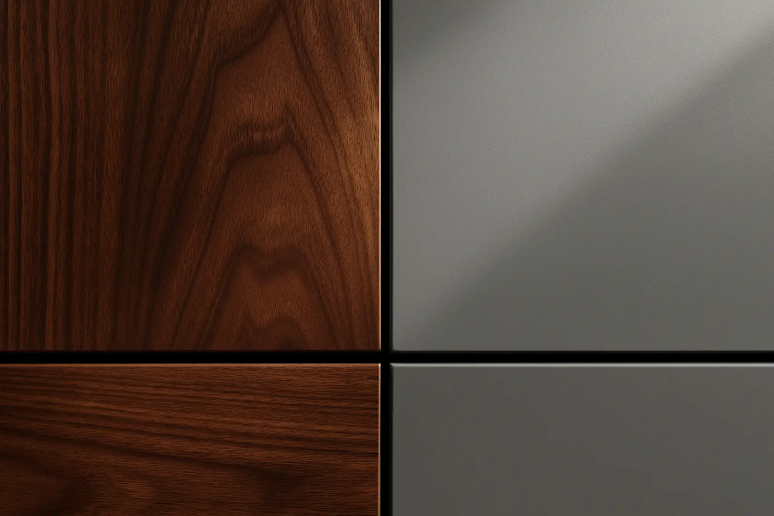
Blue occupies a useful middle ground. It carries more personality than the white and greige kitchens that dominated the last decade, but unlike a bold green or a warm terracotta, it still behaves like a neutral in a room. A deep navy base cabinet reads almost like a dark wood in the way it grounds a space, which is why it sits comfortably next to the white oak and walnut fronts common in local remodels.
There is also a light-quality reason blue does well here. Coastal and bay light skews cool and soft, and a warm-leaning blue holds its color under that light instead of going flat or gray the way some greens can. In a San Francisco kitchen with north-facing windows, a navy with a touch of warmth stays rich at midday. That interaction between paint and daylight is exactly the kind of thing worth testing on site before committing.
Choosing the Right Blue: Undertone Over Name
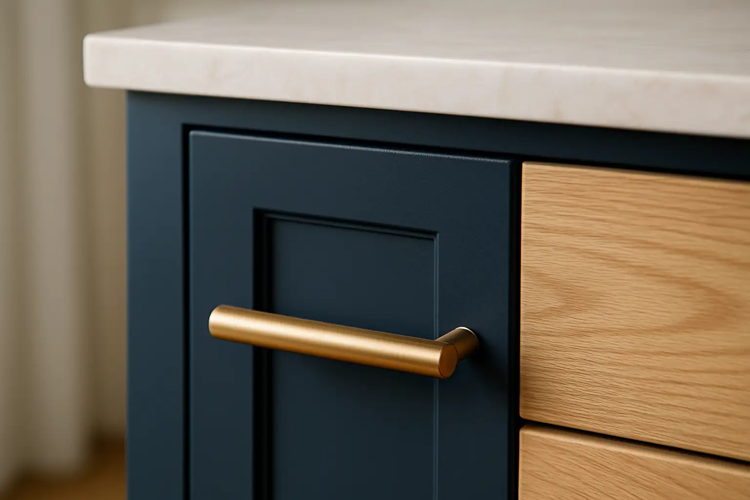
The single biggest mistake with blue cabinets is choosing from a tiny paint chip under store lighting. Blues shift dramatically with undertone. A navy with a green base leans teal, one with a red base leans purple or almost eggplant in low light, and a grayed navy stays quiet and architectural. None of these is wrong, but they set very different moods, and you want to pick on purpose.
Get a large sample, ideally a painted door or at least an eight-inch card, and live with it in the actual room for several days. Look at it in morning light, at night under your bulbs, and against your counter and floor. What we tell clients is that the color should still please you when you are tired and it is raining, not just in the showroom. Muted, slightly grayed blues in the navy-to-slate family are the most forgiving and the most likely to still feel right in ten years.
Finish and Sheen Matter More on Dark Colors
On a dark, saturated color, the finish does as much work as the pigment. We spray a catalyzed or conversion varnish that cures hard and resists the kitchen's daily assault of water, grease, and cleaning. On blue, sheen is a real decision. High gloss looks dramatic in photos but shows every fingerprint, dust film, and surface imperfection, and it demands near-perfect substrate prep. Satin or a low sheen hides smudges, cleans easily, and reads more timeless.
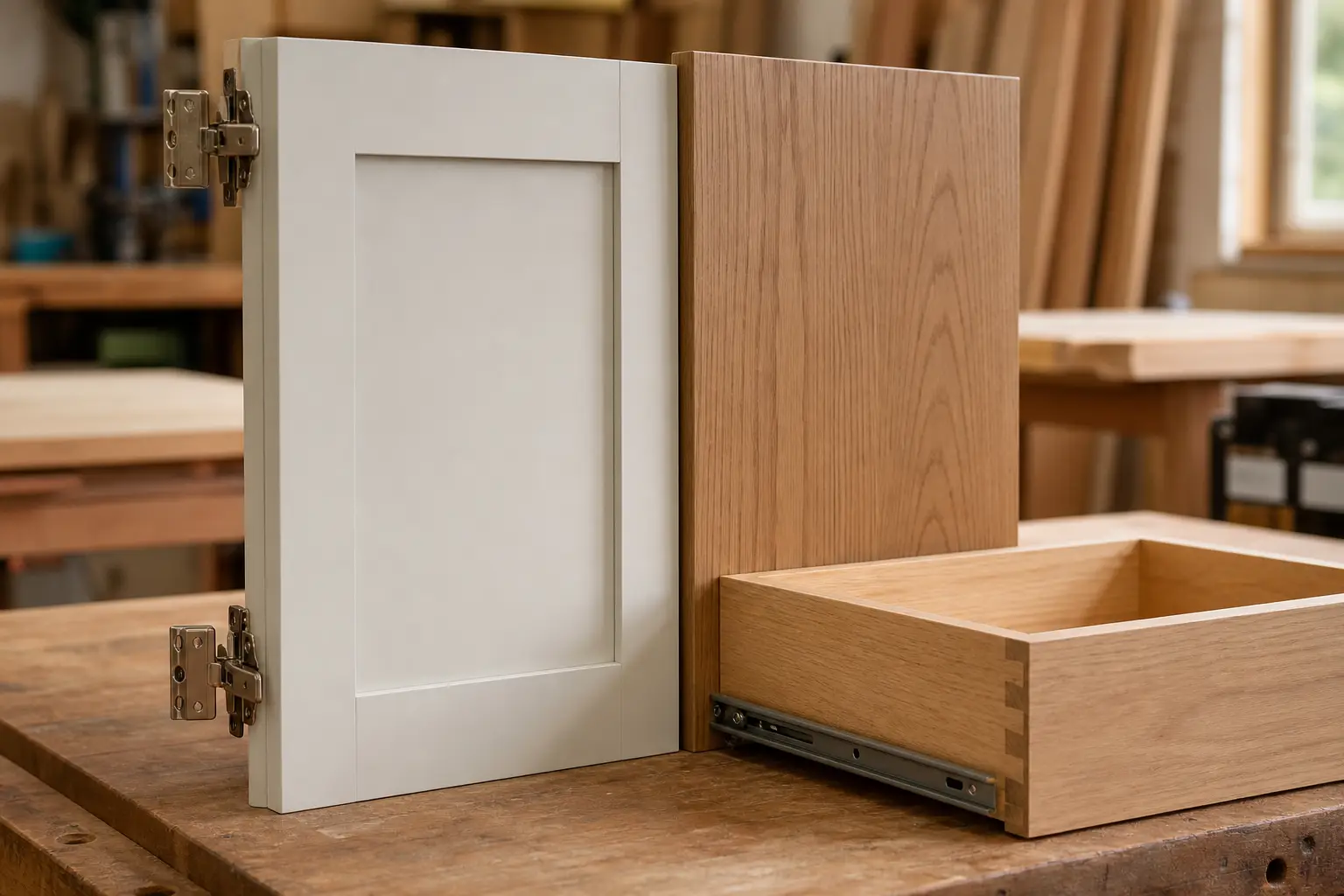
Substrate choice ties directly into this. MDF doors give the flattest, most uniform painted surface because there is no grain or panel joint to read through the color, which is why we favor MDF for painted fronts and pair it with furniture-grade plywood boxes for structural strength. If a client wants visible grain under the paint for a more traditional feel, we can spray solid wood doors, with the understanding that seasonal movement at the joints is part of the character.
Where to Put the Blue: Layout Ideas That Hold Up
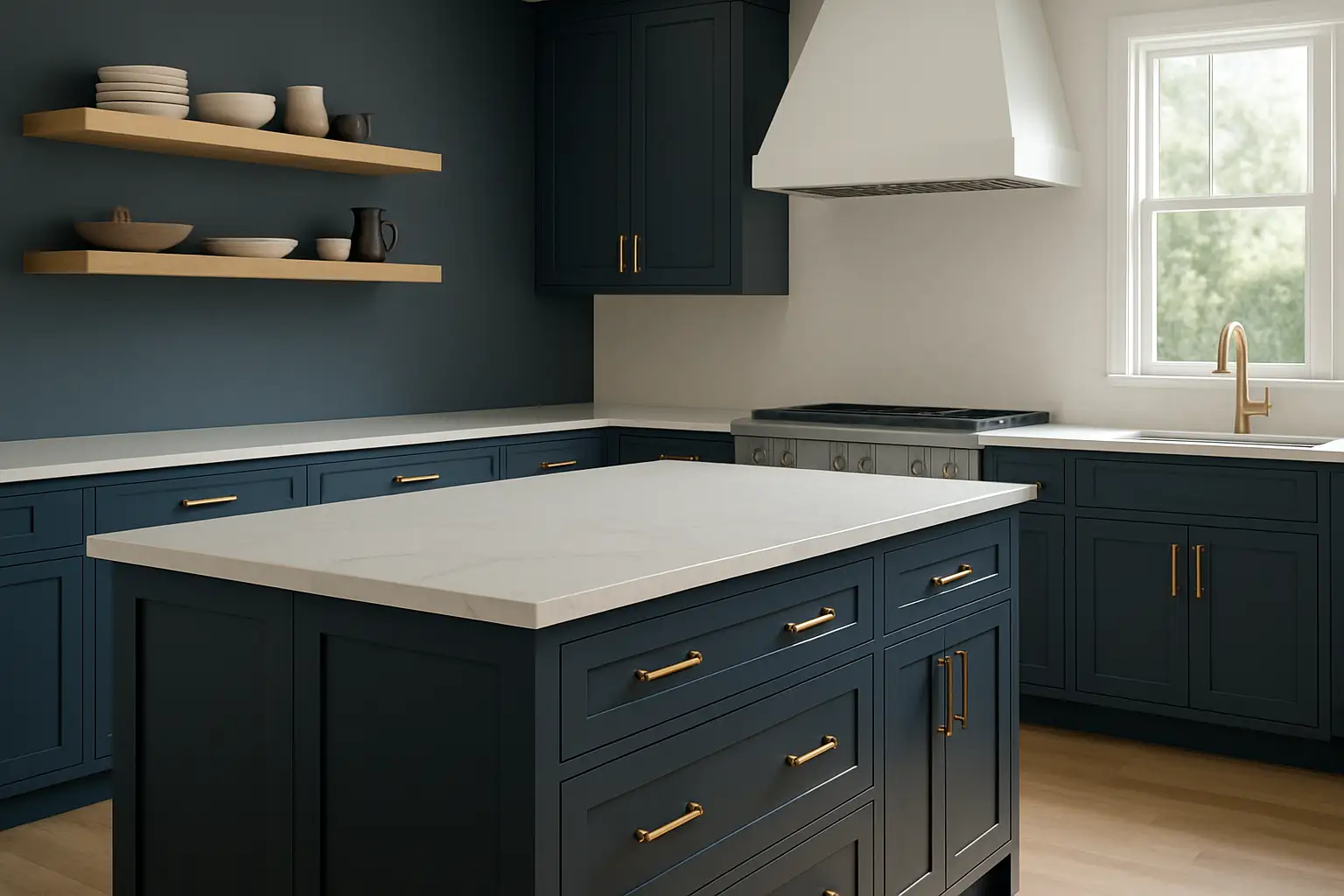
The most flexible way to use blue is a two-tone kitchen: blue on the island or the lower cabinets, and a lighter tone, natural wood, or crisp white on the uppers and perimeter. This keeps a smaller or darker kitchen from feeling closed in, and it is very much at home in the transitional style running through Peninsula remodels. A blue island under a white or wood-fronted perimeter is close to a default at this point, and for good reason.
Full blue perimeter cabinets are the stronger statement and work best where you have good natural light and enough wall area to carry the color. In a bright San Jose kitchen with generous windows, floor-to-ceiling navy with white stone counters and warm brass pulls looks deliberate and rich. A quieter approach uses blue only inside a glass-front hutch, a butler's pantry, or a run of lower drawers, giving you the color as an accent without committing the whole room. Because American Built Cabinets builds to exact dimensions in our own San Jose shop, any of these layouts can be tailored to the odd wall lengths and out-of-plumb corners that come with older Bay Area housing.
FAQ
Q1: Will blue kitchen cabinets look dated in a few years?
A1: Deep, muted blues like navy and slate have a long track record and read as neutral rather than trendy, so they tend to age well. The colors that date fastest are saturated mid-tones and anything with a strong purple or teal cast. Choosing a grayed, low-chroma blue and pairing it with natural wood and stone is the safest path to longevity.
Q2: What is the best material for painted blue cabinets?
A2: For the smoothest painted blue, MDF doors are hard to beat because they have no wood grain or joints to telegraph through the color. For boxes we use furniture-grade plywood for strength and moisture resistance. Solid wood doors can be painted too, but the stile-and-rail joints may show fine seasonal movement over time, which matters more on a dark color.
Q3: Should I do blue on all cabinets or just the island?
A3: Both work, and it depends on your light. In a bright kitchen, full blue perimeter cabinets look rich and intentional. In a darker or smaller kitchen, a blue island with lighter perimeter cabinets keeps the room from feeling heavy while still giving you the color. A two-tone layout is often the more flexible choice for Bay Area homes with limited natural light.
Q4: What countertop and hardware colors go with blue cabinets?
A4: White and warm-veined stone like a soft quartzite or marble-look quartz is the most popular counter pairing, and it keeps navy from feeling too dark. For hardware, unlacquered or satin brass adds warmth, matte black reads modern and graphic, and polished nickel keeps things classic. Warm metals generally flatter blue better than cool chrome.
Q5: Do blue cabinets show more dust, fingerprints, or wear?
A5: Dark and saturated colors show dust and smudges more than mid-tone neutrals, especially in a high-sheen finish. A satin or matte conversion varnish or catalyzed finish hides marks better and cleans easily. For a heavily used family kitchen, we usually steer clients away from high gloss on dark blue for exactly this reason.
Q6: How long does it take to get custom blue cabinets in the Bay Area?
A6: Because we manufacture in San Jose and spray our own finishes, custom painted cabinets in a blue of your choice typically take about three weeks after design and color are finalized. Local production also means we can match a specific paint color and correct a finish quickly, rather than waiting on an imported line.